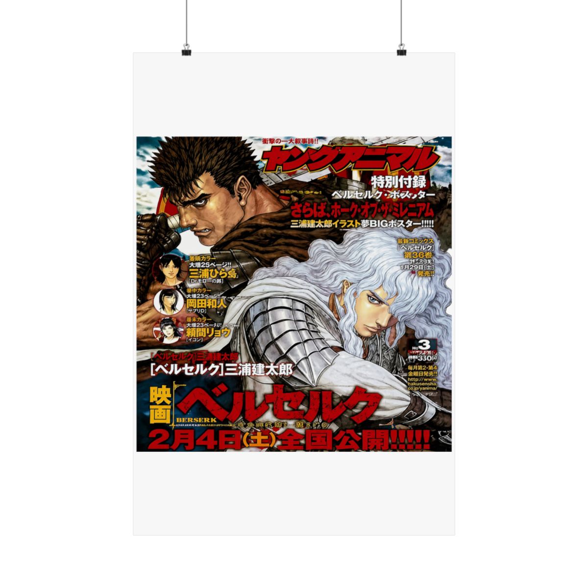
You’re rearranging your room, staring at a blank wall. The shelf has your manga volumes, the desk has your Figma Guts figure, but that space above your monitor screams for something epic. A Berserk poster can turn a corner of your space into a dark fantasy shrine. In this guide, I’ll walk you through five must-have Berserk posters for 2026, how to pick the right size and finish, and where to place them for maximum visual punch.
← Back to Blog
Top 5 Berserk Posters for Your Collection in 2026
Discover five essential Berserk posters for 2026, from iconic panels to minimalist symbols. Learn how to choose the right size, finish, and placement to make your wall a dark fantasy centerpiece.
Why Berserk Posters Are a Must-Have for Fans
Berserk isn’t just a manga; it’s a visual masterpiece. Kentaro Miura’s detailed linework and haunting compositions deserve more than a phone wallpaper. A physical poster brings the scale of his art into your room. Whether it’s the iconic Brand of Sacrifice or the Eclipse panel, these images carry weight. They spark conversations with visitors and remind you of the story’s brutal beauty every day.
The Collectibility Factor
Print-on-demand means you can find designs that capture specific moments from the Golden Age, Conviction, or Fantasia arcs. Limited runs of certain designs add rarity. Some fan artists create interpretations that feel authentic to Miura’s style. In my experience, the best posters are the ones that make you stop and study the details - the texture of the Dragonslayer, Griffith’s expression during the Eclipse.
Why 2026 Is a Great Time to Buy
Print technology has improved. Giclée prints now offer archival quality, meaning your poster won’t fade after a year. Many stores now offer multiple paper options (matte, satin, lustre) and sizes from 11x17 to 24x36. You can also find designs that fit modern decor trends like dark maximalism. It’s easier than ever to get a gallery-worthy piece.
Top 5 Official-Style Fan Posters Featuring Guts and Griffith
Here are five fan-favorite designs that consistently impress. They range from manga panel reproductions to stylized portraits.
1. Guts vs. Griffith (Golden Age) - A split composition showing Guts in berserker armor and Griffith in his white hawk outfit. The contrast makes it a striking centerpiece. Best printed at 24x36.
2. Eclipse Panorama - A wide horizontal scene of the Eclipse, incorporating the God Hand and the Brand. This one benefits from a satin finish to bring out the dark reds and blacks.
3. Struggle in Motion - A dynamic shot of Guts mid-swing with the Dragonslayer, motion lines and all. Matte finish reduces glare and matches the ink-wash feel.
4. Brand of Sacrifice Minimalist - A clean, single-symbol design on a black background. Great for a smaller space or as part of a gallery wall. 11x17 or 18x24 work well.
5. Casca and Guts (Quiet Moment) - A rare soft image from the Conviction arc, focusing on their bond. This one looks beautiful in lustre finish.
These designs are created by talented fan artists and sold through curated prints. None are officially licensed, but they capture the spirit of the series better than many mass-produced products.
How to Choose the Right Size and Finish for Your Space
Size and finish can make or break your poster’s impact. Here’s what I’ve learned from a decade in merch design.
Sizing Guidelines
- Small (11x17): Perfect for dorm rooms, cubicles, or tight spaces. Works as part of a grid gallery wall.
- Medium (18x24): The sweet spot for most walls. Fits standard frames and doesn’t overwhelm the room.
- Large (24x36): Best for the centerpiece above a bed or sofa. Requires a wide wall and a sturdy frame.
Measure your wall before buying. A poster that’s too small looks lost; too large feels cramped. Use painter’s tape to mark dimensions before ordering.
Paper Finishes
- Matte: No glare, great for detailed linework. Blacks look deep. Downsides: less vibrant colors, can look flat under direct light.
- Satin: Balanced - slight sheen, good color pop, moderate glare. My go-to for most Berserk art because it brings out the reds and golds without being glossy.
- Lustre: Similar to satin but with a subtle texture. Hides fingerprints and smudges. Ideal for high-traffic areas.
- Glossy: Avoid for dark art. The high glare washes out dark areas and reflects light unevenly.
Framing Tips
Always frame your poster behind UV-protective glass or acrylic. This stops fading from sunlight. Use acid-free matting to prevent yellowing. For standard sizes, check IKEA ($15 - $30 frames) or online custom framers. A good frame elevates a $20 poster to look like a $200 print.
Where to Display Your Berserk Posters for Maximum Impact
Placement changes how people experience the art. Consider these spots:
- Above a Desk: Keeps you motivated (or terrified) during work. Choose a smaller size so it doesn’t distract.
- Behind a Computer Setup: A large poster becomes a backdrop for streaming or video calls. Ensure lighting doesn’t create glare on your camera.
- In a Reading Nook: Pair with your manga shelf. Medium size, matte finish to avoid reflections from a reading lamp.
- Hallway Gallery Wall: Mix multiple sizes. Start with a 24x36 centerpiece, flank with 11x17s. Keep frames consistent in color (black or natural wood).
Avoid direct sunlight. UV rays will fade even the best inks within months. Use blackout curtains or position posters on south-facing walls.
Frequently Asked Questions
What size poster is best for a dorm room?
18x24. It fits standard frames and doesn’t overpower a small space. Choose a matte finish to avoid glare from overhead fluorescent lights.Are these posters officially licensed?
No, these are fan-created designs inspired by Berserk. They are not produced by Kentaro Miura’s estate or any official publisher. They still make excellent collectibles.How do I hang a poster without damaging the wall?
Use poster putty for lightweight prints (11x17). For larger sizes, use adhesive poster strips (like Command strips) or frame them and hang the frame with a nail. Avoid tape; it can tear the paper.What paper finish is best for dark anime art?
Satin or lustre. They bring out contrast without excessive glare. Matte is also good but can flatten the highlights. Glossy is not recommended for dark artwork.Can I frame a 24x36 poster?
Yes, many frames come in that size. IKEA’s Ribba series is an affordable option. Use a mat to separate the art from the glass, preventing moisture buildup.Key Takeaways
- Choose sizes that fit your wall: 11x17 for small spaces, 18x24 as a standard, 24x36 for large statement pieces.
- Satin or lustre paper finishes work best for Berserk’s dark, detailed art.
- Frame all posters with UV-protective glass to prevent fading.
- Display at eye level and away from direct sunlight.
- The top five designs listed here capture key moments and characters - they’re fan favorites for a reason.
Ready to upgrade your wall? Browse the collection and find the poster that calls to you.
Related Posts
undefined
The Ultimate Casca Merch Guide: Top Berserk Gear for Her Fans
Celebrate Casca's strength and resilience with our guide to the best Berserk merchandise, from appar...
undefinedTop 5 Berserk Mugs and Mousepads for Your Workspace
Turn your desk into a mini Band of the Hawk gathering spot. We break down the best Berserk mugs and ...
undefinedBerserk Laptop Sleeve Guide 2026: Best Tech Cases
Looking for a Berserk laptop sleeve that actually protects your machine? We break down the top desig...
Shop Berserk Merch
Official merchandise — premium quality, designed for the community.